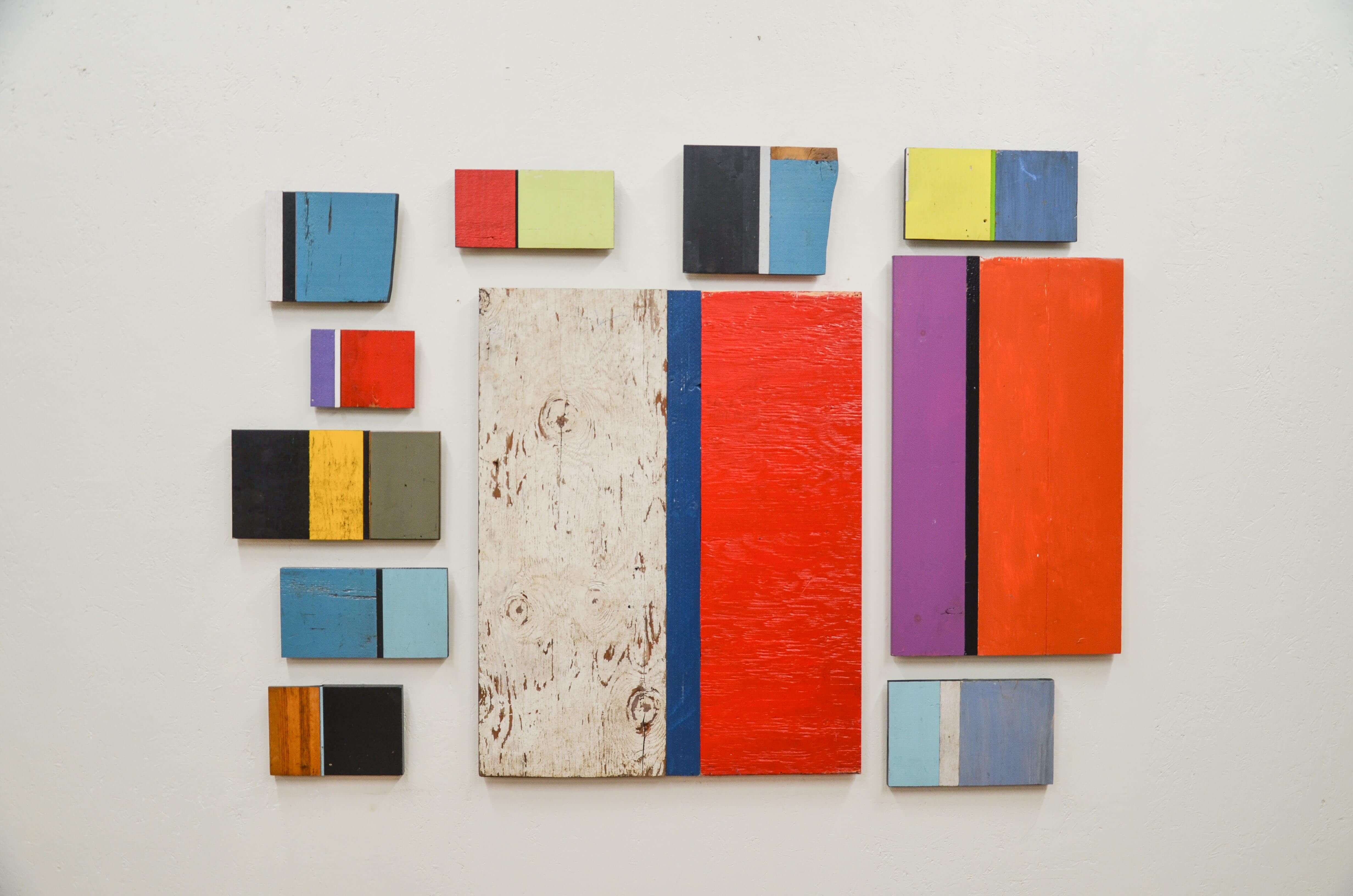
By David Spangler, Revision Division Designer & Builder
Color. I have always been deeply moved by color, especially combinations of color. As a child, I discovered I was surrounded by it. It was found in my clear marbles, whose deep hues of blue, turquoise, and ruby red sent shivers down my spine when I put them up to my eye. The tail lights of cars would beckon me to stare deeply into their beautiful, happy worlds of orange and red prisms. There was the leaded glass window by our front door that projected little rainbow islands of incredibly rich colors across our floor each sunny morning. The gently graduated hues of all the wire rimmed sunglasses on display on racks at the drug store all stirred me in ways I can barely describe. I’m still moved by these transient, and fixed, moments of color to this day.
After a year of woodcrafting in the Revision Division shop, I was beginning to yearn for color and vibrancy in our gallery to balance all the wood and metal tones of our work. I began stashing painted wood, big and small, to eventually make something with but I was not sure yet just what. With Matt, our lead designer/builder in the shop, I broached the idea of building items for the gallery out of painted wood, and he liked the idea.
My first experiment with using combinations of painted wood was in completing a batch of five or ten cabinet uppers with shelves inside, whose doors were made completely from a random and unique assortment of painted boards. While each cabinet was very useful, these were also rather cumbersome in our shop and far too time consuming to build, so I began designing a different approach.
Simplifying the product, I decided to try a horizontal, wall-hanging, shadow box idea, eliminating the time-costly doors entirely. This would speed up production time and allow me to focus on the enjoyable act of color layout. The depth of the shadow box would maintain its utility as a shelf and the backs of the shadow box would be a perfect place to showcase the painted wood—almost as wall art. I kicked off a batch of 15, and as each batch sold, I made more batches. Eventually, I became curious about trying a spin-off idea, that of unharnessing the panels of color from the tyranny of the shadow box, letting simple combinations color stand alone. No utility, just pure color. I made two, boldly trying a composition of just two colors each. One sold. That was all the encouragement I needed.
One afternoon, I had some down time and I began laying out painted boards on the floor. I decided, right away on a rigid theme of wide-thin-medium for the width and layout of the boards, and limiting it to only three colors for each piece. As I saw all the colors together below me, vibrant and subtle compositions began emerging and I was hooked. I spent a few hours arranging and rearranging about fifty possibilities before I settled on 15 of my favorites. I started production immediately.
I decided with these to leave major cut-outs, missing knot holes, and even odd edges where the wood split off at odd angles. These are easy to hang, and the batch has many different sizes for many sizes of wall spaces. This is by far the simplest, product I have ever built, and the colorful results look great in the gallery behind and above the furniture Matt and I have on display!
